Thursday 29 May 2014

2 years ago...

So I noticed recently when passing by my old blog that I haven't posted on here in almost 2 years and I thought to myself it might be nice to post something on the actual 2 year anniversary of my last post with a little clue as to what I've been up to since last being on here.... Unfortunately I sprained my ankle 2 days ago and was a little distracted yesterday when that day actually arrived so here I am a day late (woops).

Anyway I have a plan... I've taken some time away from the design world as I had had enough of being skint when I was a student, so I got myself a job (I know, how boring, but hey it pays the bills). I worked on a few personal projects over the time but I decided I missed creating interesting things so i'm trying to worm my way back in, so i'm currently in the 'work in progress' stage of setting up my own company... You'd like a little sneak peek of something i'm working on I hear you say??? Well OK, if you insist... hopefully if it goes the way i'm planning at the moment you may be seeing a lot more of this image in the future:


There... that's all i'll give away at the moment, It's a rough draft of an idea I'm working with and who knows I may completely change my mind and go in a different direction before its finished but at this time It's quite central to my plans.

Right so for now, 2 years after I was last on here (nice to know I can still figure out how to post on here) I will leave you... But don't be sad I will be back, and no it wont be in another 2 years. I'm planning on posting a lot on here in the near future, I just need to work it all out before doing so... so i'm not going to say goodbye but see you soon :)

Monday 28 May 2012

Guns


The next thing I’m posting about is my gun design. it started from my Sherlock Holmes research. The revolver was quite a popular item and kept popping up in the film so I thought a simple drawing of it would be a nice starting point. It might take my project down a sinister route.


With this image I decided to try another multi directional repeat using the stamp tool again. This time I left the background simple and I think it looks really interesting. The black gun has had a filter used on it which I think makes it more eye catching. It means it’s not all completely the same image.


I love the inverted design. I think the purple and the yellow really sit nicely together and the white guns add a feel of an ex ray. Which brings the project back round to the title hidden treasures I think. When messing around with the image when making it I simplified it and got the length design. I think it sits nicely with the full pattern as maybe a coordinating border. The image is really crisp and graphical with the black background I think.


As I tend to like doing I duplicated the original gun layer flipped it over the top of each other and then changed the opacity so you could see the different layers. I really like how this abstracts the design. At some points you can see what the image is made from but others it looks really graphical and simply line and shape.


From the guns I selected a simple bit and tried to make it into a design of its own. I think it looks nice, it’s a lot simpler than my other designs which I think is interesting. Obviously at this point you can’t tell at all what the original image was which is an added bonus, really going for literally ‘hiding the ‘treasures’ 


I then decided again to mess around with the colours to see what I could get.


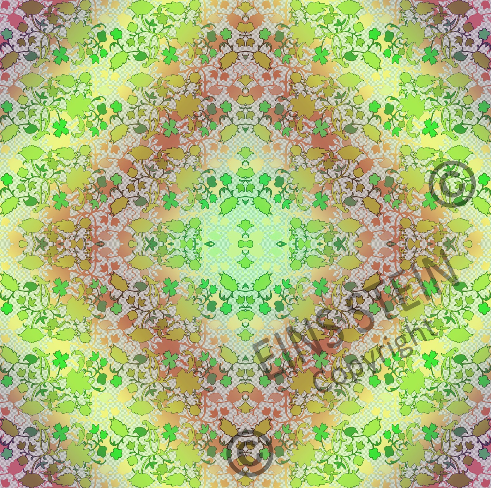
 The next thing I did was go back to my original multidirectional and see if I could make it more interesting which as you can see below I did. I added a floral pattern into the background giving the design a little extra pazaz. The background and colour palette is quite feminine whereas the sunject matter is quite masculine. Due to this I think this is the best and most interesting design I have created so far.


Because I like this design so much I made it into the repeat and actually had it printed out on a length of lining paper to see what it would look like made for the wall. Which by the way looks awesome if I do say so myself. 


Lastly I decided to try and see what the guns would look like as a full repeat along a wall. I then had the idea to fade it out and have one strip full guns, the next half gun and half flowers, and then finally have a strip which is simply the background pattern of the flowers. I think this would look great on a wall. It would add something extra to the design instead of simply having it all the same. I also tried this in a few different colour ways to see if it looked as good and to be honest I think it looks great. I still like the purple the best but it would give clients a few more options.


Again its time to love you and leave you... Good night for now. Tomorrow is a big day (setting up for my final show :S gulp, scary) so it's time to get my beauty sleep.


Posting set back


So posting each of these catch ups is taking a lot longer than expected so for now I’m going to have to love you and leave you. I have another post almost ready but I’m going for a family dinner at the moment do you'll have to wait till I get back tonight to find out what it’s about... pop back later to see what more is in store...

Keys

Rght so post number one seemed to go off without a hitch so let’s go for post number 2. After the success of the first multidirectional I tried I thought I would give it another go. I had done some simple drawings of keys using different techniques and decided to use them. I also used the stamp tool as well to add some extra colours. On top of that instead of leaving the background white or overloading the design with motifs I added the kaleidoscope pattern into the background to see what it would look like. I thought it looked great so I left it there.


I again inverted the design once repeated to see what it would look like. Although I like these colours on the shoe design I think for this one the purples are better.


I then went onto the filters and went a bit crazy changing the design around, this is one of my favourites. I used the stained glass tool to make it look more interesting.


I liked a few of the abstracted designs so I thought I would try and combine a few in an interesting way. I liked the way the image above looked with the different cells so I thought I would keep that idea but make them bigger. I really like how you can subtly tell the design continues from one cell to the next, it’s not really obvious till you actually look. I think the plain cells mean the design isn’t too complicated as well which is good. I originally planned to work into this design by hand sewing round sections but I never got round to it, but then I think it looks good as it is anyway.


This is where the chronological order doesn’t work out. I could leave these designs till later to fit in but as I am discussing the key design now I feel it’s appropriate. After the New York trip my project completely changed (ill get to that in more detail later) the colour palette also changed so I had to make some adjustments to some of my original pieces. The key design was one of them. I really like the new colours in the image below; I think it makes it stand out more.


As I liked the way the stained glass looked before I chose to do this again in the new colour palette and I think it looks awesome. As always I inverted the design as well to see what it looks like and I think it looks just as good... let me know your opinion on the designs in the comments below...


This last image is a close up of the inverted key design to show more of the detail. I love the abstract nature of the design, the fact you can still tell it’s keys but it’s not as obvious as it was when it was the normal drawings...


So 2 posts down, I don’t know how many left to go. All I know is we haven’t even made a dint in the list of updates so clear your calendar we’ll be here a while...

Ballet Shoes

So as I said I would be back to catch you all up on what has been going on over the past few months and here I am. Hmmmm where to start where to start, a lot has happened...

I’ll try and keep to chronological order if I can but sometimes that may not be possible. From the beginning I knew I wanted to try and incorporate people’s guilty pleasures into my topic so I tried my own to start with. It’s quite an innocent one but when I was young I never admitted I did ballet, it just wasn’t the cool thing to do. As I grew up I got over this but I always remember telling people I did dance but never explaining any further what I did. As I still attend classes on a Saturday I asked a few of the younger girls if I could get a few pictures of them dancing to use as primary research. One of my favourites was a simple picture of the feet and so started with this image. Instead of drawing it from scratch I tried simply adding oil pastels over a photocopy to add colour and texture. 


I think this image although slightly weird is really cool, I love the colour choice as sometimes when I look at it; it looks like her feet are on fire. I chose to simplify the image even more and trace the lines and texture from the photocopy to see what I got. I thought by not drawing the foot out properly it would make it interesting to look at as it’s simply the tone and shade being used.


From this I decided to try and make a multi directional design with this motif as I thought it was interesting and different. Instead of doing one by hand like we were taught I thought I would try the same techniques on the computer and see how it turned out. The first image is of the shoe motif being layered over itself in different colours using the stamp tool. After that I have added a picture showing what my first multidirectional came out like. Although it isn’t amazing I still really quite like it as it’s abstract. You can sometimes see what the motif is but others it’s not as obvious. I think the colour choice is also interesting because it isn’t the usual baby pink you would expect when thinking ballet, I think it helps abstract the piece more.


As I have said in the past one thing I love to do on Photoshop is to invert all my designs to see what it looks like as different colours so I tried that with this design and strangely found that I really quite like the colour combination that it came out like.


Earlier in my FMP I found the liquefy tool on Photoshop so I decided to give it another go with this design to see that it came out like. Again I think this looks awesome. The motif id completely hidden, it could have started as anything.


I then used this design to make a kaleidoscope looking flip repeat. I think this design looks awesome it’s really detailed but really abstract.


As at the time I was aiming for interior designs I had to change my design slightly to fit into the size restraints for a repeat. This meant picking out a section I like and then simply repeating that instead of the whole piece.


For now that is the first section of the catch up complete. I think if I keep typing away like I did with this post the catch up will take a very long time. O well, I guess I better start organising the next bit... see you again soon...

Long time no see part 2...

I know I said I would come back to posting a while back and didn't hold onto that promise but this time I mean it...

As you can see I’ve started with changing the look of the blog using an image of some of my final fabric's from my FMP (original image shown below) and creating a simple flip design with them to fill the background (goodbye flamingos).


Over the next day or so I will continue to fill you all in with how my FMP actually turned out but for now though, I’m going to leave it here... so I guess it’s taa taa for now...

Tuesday 17 April 2012

Long time no see...

Hey bloggers,

I know it's been a while since my last post and I do mean to get back to it soon, unfortunatly I have a deadline for proffesional practice on friday so your going to have to wait a little bit longer. The good news is I will be back just not yet... Just not yet...

Friday 10 February 2012

It's Simple

I thought it might be nice to see what simply taking the image my aunty drew of my gran when she was a young girl playing by a pool of water and repeat it would look like. I thought I would do this without any fancy tricks from Photoshop to start with. Just keeping it quite naive. It looks so different to my normal style and I’m not sure how I feel about it. It feels like it’s been done before.


As this is me working here of course I didn’t just stick to the simple style of the image above... I thought as I’m at a computer I may as well see what crazy design I could come up with with this design. Below is one of the examples that came out when playing. I don’t think that this design is as successful as the rest of my designs so far.


They're melting...

While we’re on the subject of my Aunty Lila’s work I thought I would bring a funny story up.

As I had had a lot of fun with the liquefy tool on my designs so far I started doing it to quite a few things (even photos) to see what effects I could get. One that I thought was funny was what I did to the image of my great gran Ada, and my great aunt’s Lila and Doris. So everyone knew which was which I had named them on the image and when I liquefied them they ‘melted’ so to speak.

If you look at the name it has changed from ‘Smelt sisters’ which is their proper name to the ‘Melt sisters’ instead. I think it’s quite appropriate as they are 'melting'. And it's quite funny…

Floral

So far this project hasn’t really headed in a straight line. I’ve jumped from here to there and back again. But then I like how this keeps my options open as which direction I go in when I start developing. I chose to go back and look at one of my aunties images and see what I could do with it.

I thought the flower image was really strong so thought I would work with that one. I decided to draw the outline and see if I could make a pattern from it. Or just modernise it.
I decided it looked a bit bare so added some colour which I thought looked interesting.

Again I started playing around with the blending tools. Removing the opacity of the motif as well as adding the rainbow gradient over the top. I love the colours in this, I think they are really bright and stand out nicely.


I chose to try and take a step back from the rainbow and see what a repeat would look like. I used two layers with the same design over the top of each other. On the black and white the two layers are merged together to create a denser patter however on the colour ones the background repeat is faded slightly so the front one is more prominent.


I then tried my usual flip repeat to see what the pattern would look like. I got rid of the white background and on Photoshop this means the checks show through (which I think is interesting. It makes a better background than simply white) I also had fun with the gradient tool again overlaying the pattern with different colours to see which looks best.

I then tried inverting the pattern to see what that would look like and I have to say I think these are really nice. The white borders aren’t as harsh as the black and blends nicely with the design. I especially like the purple colour palette as the colours stand out more against each other.

Let me know what you think and comment below…

Getting distracted (shocker)

Next as always I got distracted on Photoshop. I thought I would go back and look at the images I found from Sherlock Holmes and see what inspired me. Of all things the shadow of a banister on the wall stood out. I thought it was an interesting design and I thought I would take inspiration from this and create my own.


I started by drawing out a quarter of what I wanted because when I tried to do a good drawing that was equal it looked terrible.
 
I then flipped it on Photoshop to see what it would look like as a full design. When I was actually doing this I was only planning on doing the shape on the computer and then go and draw it by hand but like I said I got a little distracted doing some patterns…


Earlier in the day I had been talking to Abby while she worked on the computer and she used a tool called liquefy on her work which made it look really interesting. I decided as I was already on the computer I would give this a go myself and see what I got from it. I started simple and just accentuated some areas like the image below.

Next I went completely crazy with it. I used the tool to a point where you can’t really tell where the design came from in the beginning which I like. I also decided to add a bit of colour and found the gradient overlay on the blending tool which looked great.

When on the gradient tool I thought the design looked great in many different colour combinations so I decided to save them all and see which looked most impressive printed out. The ones I have posted here are me trying the rainbow colours in different ways which I think look great. This simple use of colour really makes the designs stand out.


After choosing my favourite I thought about the background colour and decided to try and see if it would look better than just simply leaving it white which I think it does. I love love love the turquoise one. The designs remind me of art nouvou and I think this might be a nice route to go down to see if I can get some more inspiration. I also think although I am primarily thinking of doing interior designs for my finals, I think these would look amazing printed into silk scarves or something. I could really imagine them being great like that.


 Let me know your opinions in the comment box below…